We are committed to providing an inclusive and accessible user experience of our client’s websites to their target audience. We understand how important it is to maintain proper color and contrast in making websites that are usable by individuals with diverse visual abilities. We are equipped with professionals in the field who know all the tools and technologies used to determine the proper ratio of color and contrast for the best accessibility.
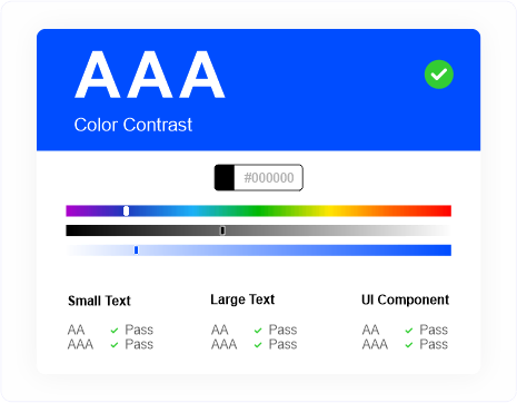
We adhere to the Web Content Accessibility Guidelines (WCAG), which offer clear standards for color contrast ratios to ensure readability and usability for visually impaired users. We ensure to carefully choose color palettes that provide sufficient contrast between the text and the background.
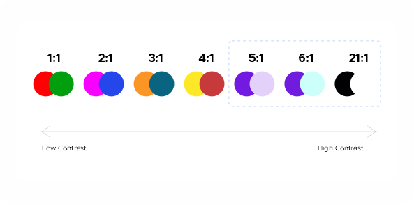
Our design team utilizes color contrast checkers and simulators to determine the contrast ratios as per WCAG guidelines. Thus, we ensure clear distinction and enhance readability and user experience.
We prioritize legibility by considering color contrast for all text elements on your website. We utilize high-contrast color combinations, such as black text on a white background (or vice versa), to improve readability.
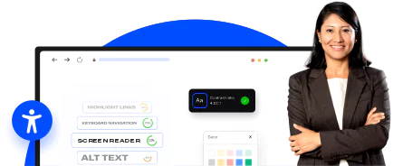
We provide alternative text or additional cues alongside color coded-information so that all users can access and comprehend the content regardless of their visual abilities.
We ensure all graphic elements, like icons, buttons, or images, exhibit suitable contrast ratios against their surrounding backgrounds so that users can seamlessly distinguish and interact with these elements.


We first discuss in detail the client’s requirements.
We then evaluate color contrast and accessibility for the website by using several tools and technologies and underlining the parameters that are not as per accessibility norms.
We then take appropriate measures to make color and contrast accessible.
We deliver the end product to the client.
We include analyzing your website thoroughly with all the graphical elements included in terms of their color contrast ratio, and then resolving the issues wherever required.
The cost of our service depends on the number of pages and complexity of your website. However, our solutions are cost-effective.
We offer quick turnaround times, but it also depends on the length and complexity of your website.
Our team of experts is well-versed in the knowledge and expertise of accessibility guidelines. Our several steps of criteria allow us to pay attention to every element of your website, making sure that you get proper color throughout your website.

Collaborating with Acadecraft has been a fantastic experience. Led by Jumi and Akash, their team consistently delivered high-quality content, always meeting the tight deadlines. They were quick to incorporate feedback, did reiterations and adapted to our requirements without hesitation. The team's proactive approach in accommodating our last-minute requests and changes was instrumental in ensuring the success of the project. Highly recommended!

We needed some short videos to improve our virtual induction training program. Acadecraft understood our elearning content requirements properly and added the essence of the content for virtual induction with gamification elements that we needed. They meticulously executed the task and crafted eLearning videos to help us achieve our goals.
I required a comprehensive elearning solution for my corporate training program, and I am mesmerized by the perfectly executed work done by Acadecraft. The professionally crafted videos align with my training objectives. Their work demonstrates experience, knowledge, and professionalism.
Their 3D elearning video solutions are amazing. They are a perfect blend of art, color, shape, sound, and editing. They create the video and make it engaging and immersive.
Partnering with Acadecraft was a game-changer for my elearning solutions in my business. I highly recommend this organization and would love to collaborate with them again.
With a holistic approach to creating powerful blended videos, Acadecraft delivered expertly executed corporate elearning solutions. I appreciate the relentless efforts of the team with their in-depth knowledge and analytical skills effectively catered to my needs.
The services Acadecraft has given me exceeded my expectations; the team actively paid attention to my requirements and went the extra mile in researching and creatively developing awesome elearning content that lines up with my corporate goals.
They exceeded my expectations, both in delivery and quality. They stuck to the turnaround time and were constantly in touch with me throughout the creation process.
I recommend working with Acadecraft for their corporate elearning solutions, as they have great hands-on use of animation, graphics, and other creative assets.

We were impressed by Acadecraft's LMS development, which they were able to customize according to our needs. Acadecraft subject matter experts were able to transfer our courses into eLearning, and their team handled it flawlessly and delivered incredible results. Working with Acadecraft was an experience to remember.
Acadecraft has been an invaluable partner in our journey towards excellence in certification. Their commitment to delivering exceptional service, coupled with their unwavering dedication to timeliness and quality, has truly set them apart.
From the outset, their team has demonstrated a keen understanding of our needs, consistently delivering reports with meticulous attention to detail. Their responsiveness is commendable; whenever we've reached out with queries or requests, they've always been prompt and accommodating, ensuring a smooth and seamless experience.
One of the standout aspects of Acadecraft's service is their ability to deliver reports in a timely manner without compromising on quality. This has been instrumental in our decision-making processes, allowing us to make informed choices based on accurate and insightful data.
Acadecraft has consistently exceeded our expectations with their exemplary service, timely responsiveness, and unwavering commitment to quality.

Acadecraft's Voice-Over service was amazing! The team provided accurate and culturally relevant recordings for what we expected. They showed true professionalism and expertise. We highly recommend Acadecraft for their excellent Voiceover services.

Always impressed with Acadecraft's expertise! Their translation services play a vital role for our company to drive international growth within our team and clients.

AcadeCraft's assessment content creation team was able to understand our unique requirements and created customized assessments that fit our needs. The team was prompt and professional, and the quality of their work was good.

Acadecraft have recorded several audiobooks for us. They have a wide range of talented artists with different accents who really bring our stories to life. Their work is of high quality, with good attention to detail.
Acadecraft are reliable, efficient and friendly. Their services are highly recommended by us.

As a producer, I've had the pleasure of using Acadecraft for sourcing VO and liaising with artists for several film projects. They offer a wide range of VO profiles and the artists I have collaborated with all were talented and professional. The team at Acadecraft have supported me with great professionalism, responsiveness and creativity. I highly recommend their services.

Acadecraft has been helpful with connecting our editorial team with subject matter experts (SMEs) who help us QA assessments and create solutions for computational assessments. They have been able to find SMEs to meet our needs and our deadlines. We are happy to continue to partner with Acadecraft.

Acadecraft team is always very supportive, and we and Acadecraft corroborate to create educational contents for K12 Students in India.
We appreciate Acadecraft teams' professionality, punctuality, creation skills in each subject.
I am thrilled to share my testimonial for Acadecraft which creates interactive and engaging content. Working with this team has been an absolute pleasure from start to finish. Not only did they create outstanding content for our project, but they also went above and beyond to ensure that it was interactive, engaging, and effective.
Throughout the entire process, the team was highly cooperative and communicative, always available to resolve any issues or concerns that arose. They truly made us feel like partners in the project, and their dedication to delivering high-quality content was evident in every interaction.
Thanks to their exceptional work, our project was a huge success, and we couldn't be happier with the results. I highly recommend them to anyone looking for a team that is passionate, professional, and committed to excellence. Wishing them all the best in their future endeavors.

The team at Acadecraft has truly been an end-to-end service provider for us, providing content development services and their commitment, attention to detail and expertise have made the project a success. Their team's dedication, attention to detail, and expertise have been unmatched, making our partnership an absolute pleasure. We highly recommend Acadecraft to anyone looking for a reliable and efficient education solutions provider.

Our experience working with Acadecraft has been great. Their highly knowledgeable team of experts was always available to answer our questions, provide guidance, and ensure we were delighted with the services. Their thorough, accurate assessments provided valuable insights that helped us make informed decisions about our exam performances.
We look forward to continuing our partnership with Acadecraft and leveraging their expertise to help us achieve our business goals.

I recently used Acadecraft's Video Editing services and I am extremely impressed with the quality of their work. The team at Acadecraft was highly professional, attentive and skilled in delivering my company’s project on time and within budget.
Their attention to detail was impeccable, and they understood my needs and requirements very well. They were able to create a video that not only met my expectations, but far exceeded them.
Throughout the process, they kept me informed and updated on the progress of the project, and were always available to answer any questions I had. Their customer service was excellent, and they were always friendly and easy to work with.
I highly recommend Acadecraft's Video Editing services to anyone who is looking for a high-quality and professional video editing experience. They are truly experts in their field and I look forward to working with them again in the future.
The video creation team of Acadecraft is insightful. They understood my requirements carefully and delivered a winning video that perfectly aligned with my business needs.
With a good script, content, sound, and editing – Acadecraft helped me with the best video content to strategize my marketing and promotional campaigns. Their tremendous experience in video editing and professionalism in serving the customer before and after delivering services are commendable.
The passionate team knows great about getting into the details and providing impeccable video services. I am extremely impressed by the work Acadecraft has delivered to me.
I appreciate my collaboration with Acadecraft and look forward to availing of services again.

I am thoroughly astounded by Acadecraft's proficient skills! Their exceptional voiceover and translation services were instrumental in amplifying our marketing endeavors and video promotions. They enabled us to communicate effectively with varied audiences and significantly propelled growth across numerous media platforms.

Working along with Acadecraft has been an exceptional journey. Their meticulous attention to detail and commitment to maintaining the essence of the content in the transition from English to Arabic was truly impressive. The collaborative spirit and timely communication made the entire process smooth and enjoyable. Without a doubt, I wholeheartedly endorse their services for a remarkable translation experience.
I am delighted to share my feedback with you on working on the editing and print layout of 9 documents under the KECF project. Overall, I am very happy with the speed with which these documents were edited and the fine attention to details. I also deeply appreciate the quick corrections that were made on our request. Particularly, working with Sanjana was a real pleasure, as I found her very attentive to our requests and her internal quality checks before she sent the documents to us greatly reduced my workload. So many thanks Sanjana! I look forward to working with your agency if such a need arises in future too. Many thanks to Sanjana and your entire team.

I am pleased to share that Acadecraft has demonstrated an excellent understanding of our Operations processes, ensuring a smooth and efficient knowledge transfer. The team, including the project coordinators, is highly responsive and addresses any concerns swiftly leading to effective resolutions and seamless delivery.
With our continued global expansion and projects- it was necessary that we join in partnership with Acadecraft. As they have assisted us in increasing production value in all sectors of our company; providing great infrastructure with top professionals. Acadecraft represents efficiency to execution to many of our projects and initiatives with a standard of excellence unmatched.